
It's just incomprehencible how evolution managed to spawn a species called art critic?
Would you pay $90m for this oddity from Hockney?
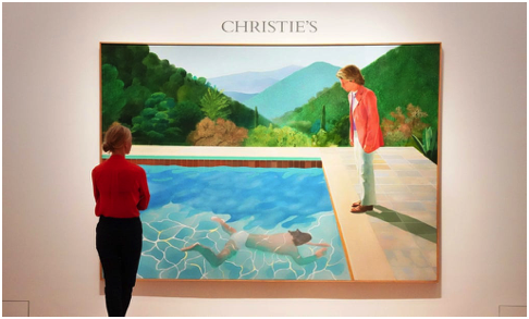
Portrait of an Artist (Pool with Two Figures)
This masterpiece from David Hockney was sold by Christie's auction house in Manhattan. They described the work as, “one of the great masterpieces of the modern era”. The Gaurdian tells us that "a smartly dressed man, standing on the edge of the pool, looks pensively at another figure swimming toward him in glistening waters." Quite honestly, the chap on the side looks a bit of a nitwit.
Will Gompertz took some time off from seeking to grasp the essence of Dua Lipa's music to explain why this piece was worth $90m:
"Structure is one factor. It has a geometric formality - squares, rectangles and triangles - that provides a coherent and solid framework in which the more complex effects Hockney wants to capture can be clearly expressed." He goes on:
"And so our senses are aroused and receptive, while our desire for order is satisfied by the simplicity of geometric shapes."
Complete lunacy! By the way, that women is not part of the picture.
Kapoors T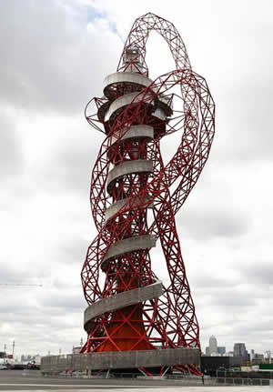 ower, just one large mocking piss take
"Up close the steel tubes that have been bolted together to create Anish Kapoor and Cecil Balmond's homage to the architecture of dreams are not merely red, as they appear from a distance. They are deeply, organically, warmly and carnally red, a red of freshly exposed arteries and organs...."
Well, that was the Guardian's view, here's another view, it's a pile of junk, a waste of £22 million, (even if most of the money came from steel billionaire Lakshmi Mittal).
Value for Money at B&Q
For only £8 you could see the Turner Prize shortlisted exhibits at Tate Britain. This really is an opportunity to experience British comedy at its best.
Jonathan Jones, art critic for The Guardian, who is also one of the judges, said:
'I think it's going to be a classic Turner Prize, to remind people why it's such a great prize, and re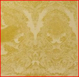 mind people why British art is so exciting.'
We were all breathless here at Blast It and we spotted the winner. Richard Wright's 'Untitled' work, which includeed intricate patterns from gold leaf painted across one wall of the gallery. Apparently, this was Richard's 'most complex and ambitious composition to date'. Sometimes words don't have to mean anything.
Strange how it looks like a roll of wallpaper that anyone can buy from B&Q for £5.99.
The Prize jury said they: "admired the profound originality and beauty" of Wright's work.
Poet Laureate Carol Ann Duffy, who presented the award to Wright, praised the shortlisted artists. She said: "This years shortlist shows we have some of the most inventive artists in the world working in Britain.
(Carol is the biggest selling living British poet... why?)
"We need artists' unique perspectives on the enormous challenges facing us."
(What, like solving the banking crisis, the global warming crisis, the justice system crisis, the elderly care crisis, the dirty hospital crisis. No, not solving, just providing a new way of looking at things. Right, yeah, really useful.)
Wright himself said: "I am interested in placing painting in the situation where it collides with the world; the fragility of that existence. Being here for a short period of time, I feel, heightens the experience of it being here."
(You're not actually here Richard, you only think you are.)
He added: "Sometimes I feel a sense of loss because I can't repeat the work... but maybe that sense of loss is part of the point."
(It certainly is and we all share your loss, Human Resources at B&Q have decided to move you to the gardening department.)
Stella on the stairs